Exploring Color Theory and Its Application in Interior Design for Residential Spaces
Color theory is a fundamental aspect of interior design, influencing the mood and perception of residential environments. This article examines the core principles of color and their practical application in home aesthetics.
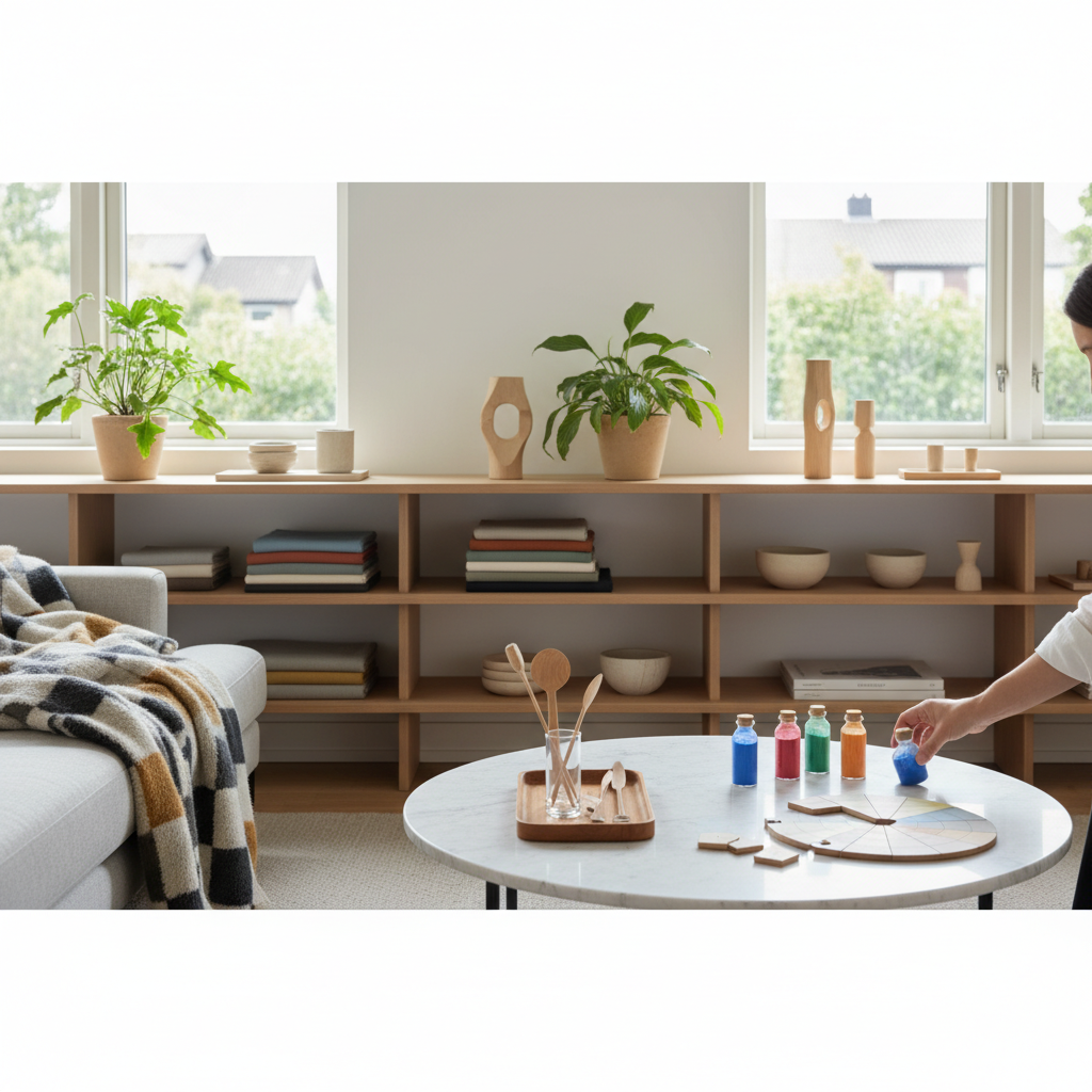
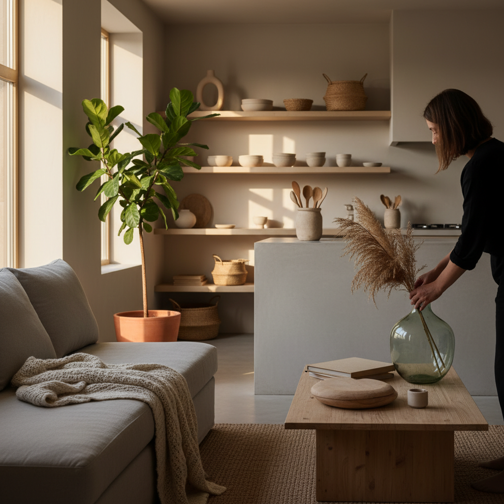
The strategic use of color is a powerful element within interior design, capable of transforming a space's atmosphere, influencing perceptions of size, and evoking specific emotional responses. Color theory, a comprehensive framework for understanding how colors interact and combine, provides a structured approach for designers and homeowners alike to make informed decisions about their living environments. This systematic understanding encompasses the relationships between colors, their psychological impact, and the various schemes that can be employed to create cohesive and aesthetically pleasing residential interiors. Delving into the fundamentals of the color wheel, the properties of individual colors, and the effects of different lighting conditions offers a pathway to mastering the art of creating harmonious and functional spaces through color.
The Fundamentals of Color Theory
Color theory is built upon several foundational concepts that describe how colors are derived and how they relate to one another. Understanding these principles is essential for effective color application in any design context.
The Color Wheel
The color wheel is a circular diagram that illustrates the relationships between colors. It is typically divided into 12 distinct hues. Primary colors, which are red, yellow, and blue, form the basis of the wheel and cannot be created by mixing other colors. Secondary colors, such as orange, green, and purple, are formed by mixing two primary colors. Tertiary colors, including red-orange, yellow-orange, yellow-green, blue-green, blue-violet, and red-violet, are created by combining a primary color with a neighboring secondary color. This arrangement visually represents how colors transition and blend.
Color Temperature
Colors are broadly categorized into warm and cool temperatures, each carrying distinct associations. Warm colors, like reds, oranges, and yellows, are often associated with energy, passion, and comfort, tending to advance visually and make spaces feel cozier. Conversely, cool colors, such as blues, greens, and purples, are typically linked to serenity, calmness, and spaciousness, often receding visually and making rooms appear larger. The careful balance or deliberate dominance of a particular color temperature contributes significantly to the overall feeling of a room.
Hue, Saturation, and Value
Beyond their position on the color wheel, individual colors are defined by three core properties: hue, saturation, and value. Hue refers to the pure color itself, such as red or blue, and is what typically identifies a color. Saturation, also known as chroma, describes the intensity or purity of a color; a highly saturated color appears vibrant, while a desaturated color seems muted or closer to gray. Value, or lightness/darkness, indicates how much white or black is mixed into a color. High-value colors are tints (lighter), while low-value colors are shades (darker). Adjusting these properties allows for a wide range of variations from a single base hue.
Understanding Color Schemes in Interior Design
Various color schemes, or palettes, are derived from the color wheel to create specific visual effects and maintain aesthetic coherence within a space. Each scheme follows a particular arrangement of hues.
Monochromatic Schemes
Monochromatic schemes utilize different shades, tints, and tones of a single hue. This approach creates a subtle, harmonious, and sophisticated look, providing a sense of depth and tranquility. While limited in hue, variation in saturation and value can prevent the scheme from appearing monotonous.
Analogous Schemes
Analogous schemes involve colors that are adjacent to each other on the color wheel, typically three to five colors. For example, a palette might include blue, blue-green, and green. This scheme offers a harmonious and comfortable feel, as the colors naturally blend. One color typically dominates, while others serve as supporting elements.
Complementary Schemes
Complementary schemes consist of two colors located directly opposite each other on the color wheel, such as red and green, or blue and orange. These pairs offer high contrast and visual vibrancy, creating a dynamic and energetic feel. While powerful, complementary schemes require careful balance to avoid overwhelming a space, often with one color dominating and the other used as an accent.
Triadic Schemes
Triadic schemes employ three colors that are equally spaced around the color wheel, forming a perfect triangle. Examples include primary colors (red, yellow, blue) or secondary colors (orange, green, purple). This scheme offers a rich, balanced, and vibrant palette. Similar to complementary schemes, one color typically serves as the dominant hue, with the others acting as accents.
Tetradic or Rectangular Schemes
Tetradic schemes, also known as rectangular schemes, use four colors arranged in two complementary pairs, forming a rectangle on the color wheel. This complex scheme offers the greatest variety in terms of hue but also presents a significant challenge in maintaining balance and harmony. Careful consideration of dominant and accent colors is crucial to prevent a chaotic appearance.
Psychological and Emotional Impact of Colors
Beyond their aesthetic appeal, colors are known to evoke specific psychological and emotional responses, which is a key consideration in interior design.
Red
Red is often associated with energy, passion, excitement, and warmth. In interiors, it can stimulate conversation and create a sense of intimacy, but its intensity requires careful application to avoid overstimulation.
Blue
Blue typically conveys feelings of calmness, serenity, and stability. It is often used in bedrooms and bathrooms to promote relaxation and tranquility. Lighter blues can make a room feel expansive and airy.
Yellow
Yellow is linked to happiness, optimism, and cheerfulness. It can brighten a space and evoke a sense of warmth and welcome. Brighter yellows are stimulating, while softer shades can be soothing.
Green
Green is widely associated with nature, balance, growth, and renewal. It offers a refreshing and harmonious presence, often used to create a tranquil environment, suitable for nearly any room.
Orange
Orange combines the energy of red with the cheerfulness of yellow, often symbolizing enthusiasm, creativity, and warmth. It can be a welcoming and stimulating color, particularly effective as an accent.
Purple
Purple is historically linked to luxury, royalty, and creativity. Its various shades can range from deep, rich hues that suggest sophistication to lighter, lavender tones that promote relaxation and introspection.
Neutrals (White, Black, Gray, Beige)
Neutral colors provide a versatile backdrop for other hues and contribute to a sense of balance and sophistication. White can make a space feel clean and expansive, black adds drama and depth, gray offers modern elegance, and beige provides warmth and versatility. Neutrals allow accent colors to stand out and create a timeless foundation.
Applying Color Theory in Residential Settings
Implementing color theory effectively involves more than just selecting a favorite color; it requires strategic planning and an understanding of how colors interact with the environment.
Creating Flow Between Rooms
To achieve a cohesive home, designers often consider the flow of color between adjacent rooms. This can involve using a consistent dominant neutral across the home and introducing varying accent colors in different spaces, or by selecting an analogous scheme that transitions smoothly from one room to the next, maintaining visual continuity.
Utilizing Accent Colors
Accent colors are typically bold hues used sparingly to draw attention to specific features, add personality, or provide visual interest within a predominantly neutral or monochromatic scheme. They can be introduced through textiles, artwork, decorative objects, or a single piece of furniture, offering flexibility and ease of change.
Considering Natural Light
The quality and quantity of natural light significantly influence how colors appear within a space. Rooms with ample natural light may tolerate bolder, deeper colors, while rooms with limited light might benefit from lighter, brighter hues to enhance perceived spaciousness and brightness. The direction of light—north, south, east, or west—also affects how colors are perceived throughout the day.
The Role of Texture and Pattern
Texture and pattern are integral to how color is experienced. A smooth, glossy surface can make a color appear more vibrant and reflective, while a rough, matte texture can absorb light, making the same color appear softer and deeper. Patterns introduce multiple colors and shapes, adding visual complexity and depth, and requiring careful coordination with the overall color scheme to prevent visual clutter.
In conclusion, color theory serves as an indispensable guide for making informed design choices in residential interiors. By understanding the fundamentals of the color wheel, the properties of individual colors, and the psychological effects they evoke, individuals can intentionally craft spaces that not only appeal visually but also profoundly influence the mood and functionality of their homes. The thoughtful application of color schemes, attention to natural light, and the integration of texture and pattern collectively contribute to creating environments that are both aesthetically harmonious and emotionally resonant.
More from home living
The Principles of Biophilic Design in Residential Interiors
Biophilic design integrates natural elements and processes into built environments to foster a connection between occupants and nature. This approach focuses on enhancing well-being and creating restorative living spaces through strategic design choices.
Maximizing Space: Principles of Vertical Storage Solutions for Compact Living
Vertical storage solutions are a fundamental approach to optimizing space in compact residences. This method leverages cubic footage to enhance organization and functionality, addressing the challenges of limited floor area.
Optimizing Storage Solutions for Specific Household Zones
This article examines systematic approaches to optimizing storage solutions within various household zones. It details principles for effective organization, considering the unique demands of different residential areas to enhance functionality and accessibility.
Embracing Sustainable Materials in Modern Home Design: A Practical Guide to Eco-Conscious Interiors
Explore the growing trend of integrating sustainable materials into contemporary home design, offering practical insights and examples for creating eco-conscious and stylish living spaces. This guide delves into various sustainable options, from recycled content to natural fibers, and provides actionable advice for homeowners looking to make environmentally responsible choices without compromising aesthetics or functionality.